Basic Visualization#
At the end of this lesson you will learn:
how to use xarray’s convenient matplotlib-backed plotting interface to visualize your datasets.
that
hvplotprovides an equally convenient interface for bokeh-backed plots
import matplotlib as mpl
import matplotlib.pyplot as plt
import numpy as np
import xarray as xr

%config InlineBackend.figure_format='retina'
Load data#
First let’s load up a tutorial dataset to visualize.
ds = xr.tutorial.open_dataset("air_temperature_gradient")
ds
<xarray.Dataset> Size: 62MB
Dimensions:  (lat: 25, time: 2920, lon: 53)
Coordinates:
  * lat      (lat) float32 100B 75.0 72.5 70.0 67.5 65.0 ... 22.5 20.0 17.5 15.0
  * lon      (lon) float32 212B 200.0 202.5 205.0 207.5 ... 325.0 327.5 330.0
  * time     (time) datetime64[ns] 23kB 2013-01-01 ... 2014-12-31T18:00:00
Data variables:
    Tair     (time, lat, lon) float64 31MB ...
    dTdx     (time, lat, lon) float32 15MB ...
    dTdy     (time, lat, lon) float32 15MB ...
Attributes:
    Conventions:  COARDS
    title:        4x daily NMC reanalysis (1948)
    description:  Data is from NMC initialized reanalysis\n(4x/day).  These a...
    platform:     Model
references: http://www.esrl.noaa.gov/psd/data/gridded/data.ncep.reanaly...This dataset has three “data variables”, Tair is air temperature and dTdx
and dTdy are horizontal gradients of this temperature field. All three “data
variables” are three-dimensional with dimensions (time, lat, lon).
Basic plotting: .plot()#
DataArray objects have a plot method. This method creates plots using
matplotlib so all of your existing matplotlib knowledge carries over!
By default .plot() makes
a line plot for 1-D arrays using
plt.plot()a
pcolormeshplot for 2-D arrays usingplt.pcolormesh()a histogram for everything else using
plt.hist()
Histograms#
Tair is three-dimensional, so we got a histogram of temperature values. Notice
the label on the x-axis. One of xarray’s convenient plotting features is that it
uses the attrs of Tair to nicely label axes and colorbars.
ds.Tair.plot()
(array([   2182.,   60537.,  195026.,  233763.,  315219.,  635948.,
         778807., 1192236.,  453381.,    1901.]),
 array([221.  , 230.64, 240.28, 249.92, 259.56, 269.2 , 278.84, 288.48,
        298.12, 307.76, 317.4 ]),
 <BarContainer object of 10 artists>)
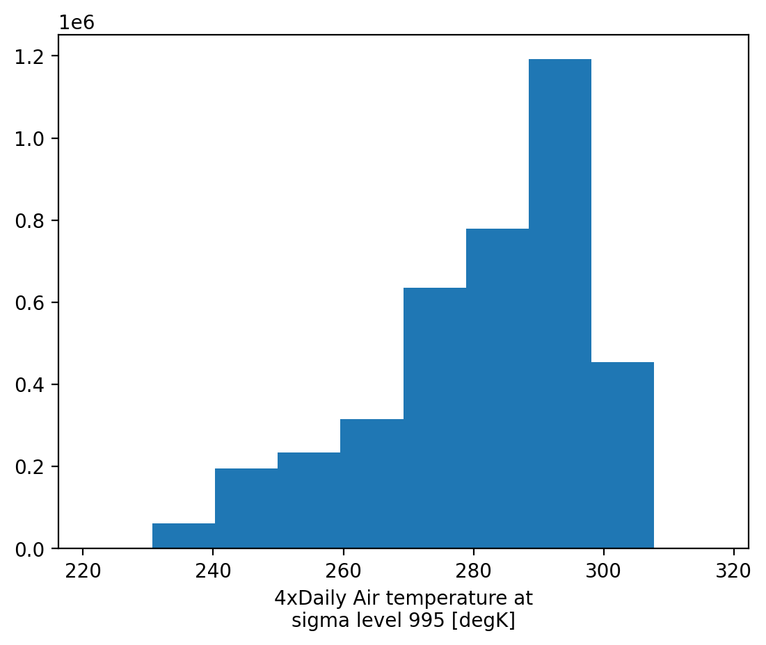
You can pass extra arguments to the underlying hist() call. See the matplotlib
docs for
all possible keyword arguments.
Tip: Note that the returned values are exactly what matplotlib would return
Exercise#
Update the above plot to show 50 bins with unfilled steps instead of filled bars.
2D plots#
Now we will explore 2D plots. Let’s select a single timestep of Tair to
visualize.
ds.Tair.isel(time=1).plot()
<matplotlib.collections.QuadMesh at 0x7f5cea0c89e0>
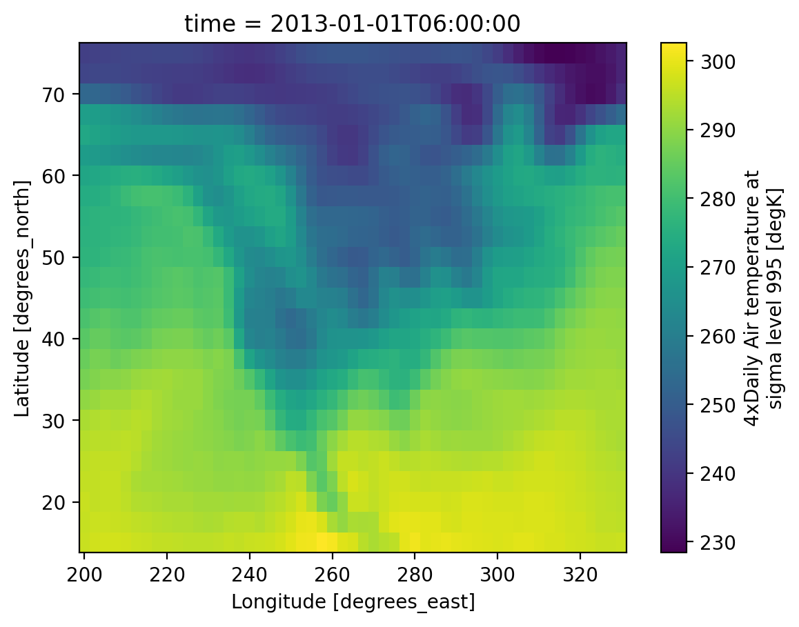
This is identical to .plot.pcolormesh which is more explicit
ds.Tair.isel(time=1).plot.pcolormesh()
<matplotlib.collections.QuadMesh at 0x7f5ce9fe5340>
Notice how much information is on that plot!
The x- and y-axes are labeled with full names — “Latitude”, “Longitude” — along with units.
The colorbar has a nice label, again with units.
And the title tells us the timestamp of the data presented.
plot.pcolormesh takes many keyword arguments and is quite sophisticated.
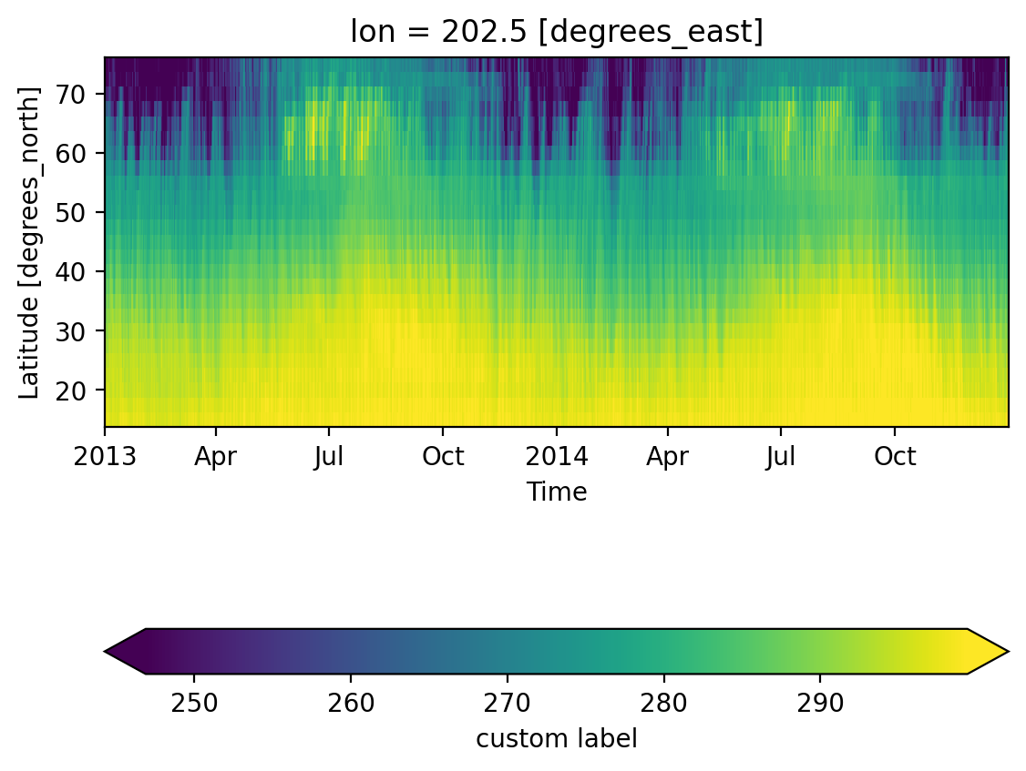
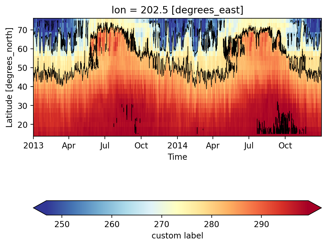
Here is a more complicated figure that explicitly sets time as the x-axis,
customizes the colorbar, and overlays two contours at specific levels.
Tip: Other options for 2D plots include .plot.contour, .plot.contourf, .plot.imshow
ds.Tair.isel(lon=1).plot(
    x="time",  # coordinate to plot on the x-axis of the plot
    robust=True,  # set colorbar limits to 2nd and 98th percentile of data
    cbar_kwargs={  # passed to plt.colorbar
        "orientation": "horizontal",
        "label": "custom label",
        "pad": 0.3,
    },
)
<matplotlib.collections.QuadMesh at 0x7f5cea0a80e0>
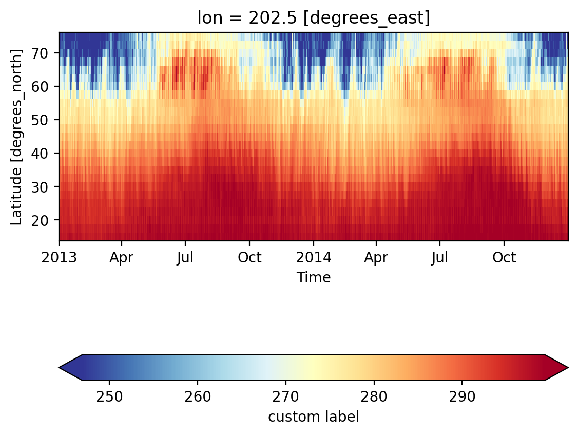
Exercise#
Update the above plot to use a different matplotlib colormap.
<matplotlib.collections.QuadMesh at 0x7f5ce6f50b60>
Exercise#
Now overlay a contour plot on top of the previous plot
<matplotlib.contour.QuadContourSet at 0x7f5ce6ec51c0>
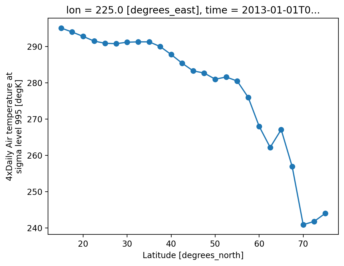
1D line plots#
xarray is also able to plot lines by wrapping plt.plot(). As in the earlier
examples, the axes are labelled and keyword arguments can be passed to the
underlying matplotlib call.
ds.Tair.isel(time=1, lon=10).plot(marker="o")
[<matplotlib.lines.Line2D at 0x7f5ce6d54e90>]
Again, this is equivalent to the more explicit plot.line
ds.Tair.isel(time=1, lon=10).plot.line(marker="o")
[<matplotlib.lines.Line2D at 0x7f5ce6d2f3b0>]
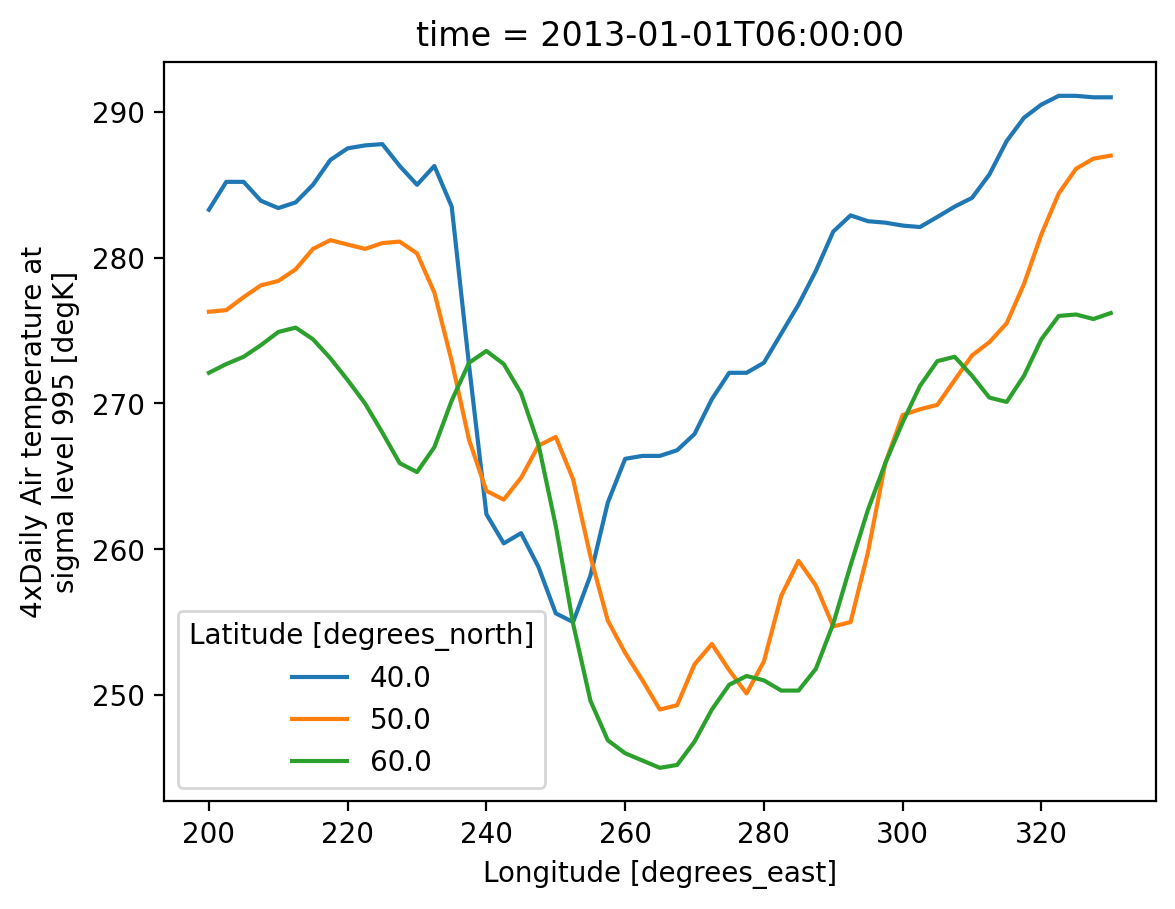
Multiple lines with hue#
Lets say we want to compare line plots of temperature at three different
latitudes. We can use the hue kwarg to do this.
ds.Tair.isel(time=1).sel(lat=[40, 50, 60], method="nearest").plot(x="lon", hue="lat")
[<matplotlib.lines.Line2D at 0x7f5ce6bcd070>,
 <matplotlib.lines.Line2D at 0x7f5ce6bcd0a0>,
 <matplotlib.lines.Line2D at 0x7f5ce6bcd190>]
Customization#
All of xarray’s plotting functions take an large list kwargs that customize behaviour. A full list can be seen here. That said xarray does not wrap all matplotlib functionality.
The general strategy for making plots that are more complicated that the examples above is
Create a matplotlib axis
axUse xarray to make a close approximation of the final plot specifying
ax=ax.Use
axmethods to fully customize the plot